
For service providers and nonprofits, imagery can feel tricky. Your activity might be more abstract or conceptual, and not as obviously visual as, say, a craft business or a restaurant. And when it comes to your website or social media, it can feel daunting to find photos or illustrations that don’t look like they came straight out of a free stock image repository.
The good news is there are some practical ways around this.
Start with real photography if possible
Nothing makes a business feel more genuine than real photos. They build trust immediately in a way stock images don’t. The challenge, especially for service providers, is that a lot of the work happens at a desk, and six photos of someone typing might not feel representative of your work and its impact.
When I worked with Elisa, a retail design consultant, we solved this by organising a photoshoot in her home – a space she had designed herself, which made it authentically hers. We planned varied shots: her sketching at her desk, browsing books, close-ups of her thesis with stationery and glasses, and of course a few portraits – some with a neutral background for flexibility, others showing more of her home environment. The result felt personal and cohesive in a way no stock library could have produced.
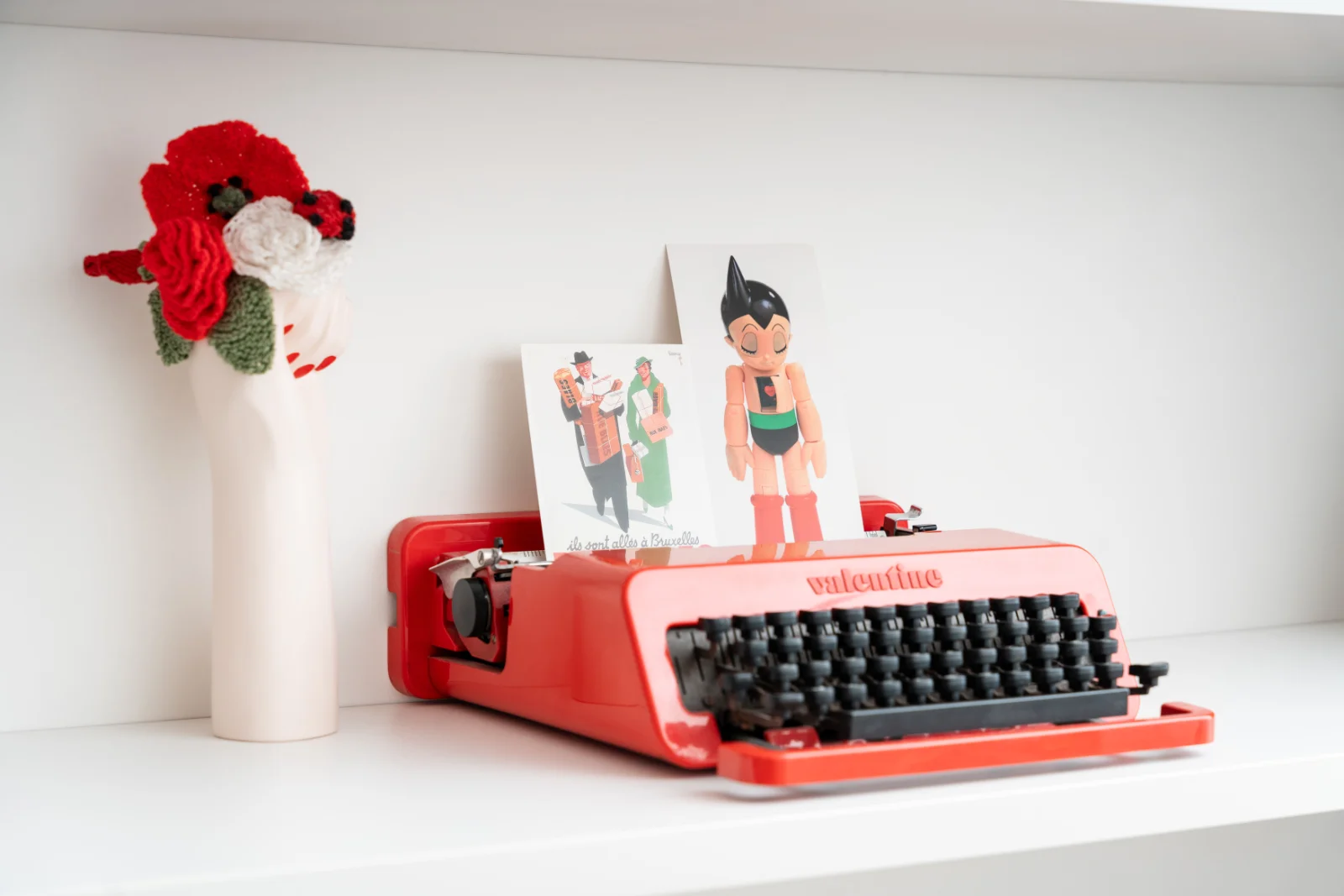
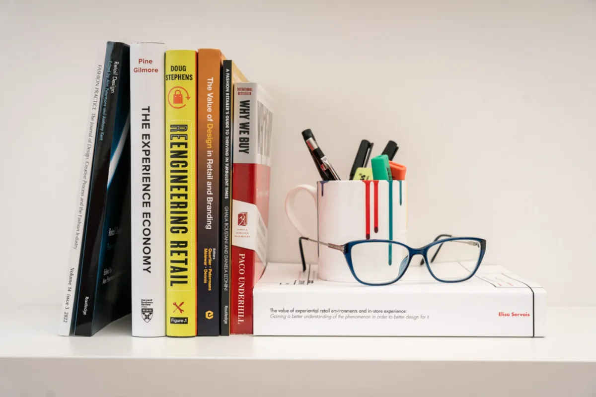
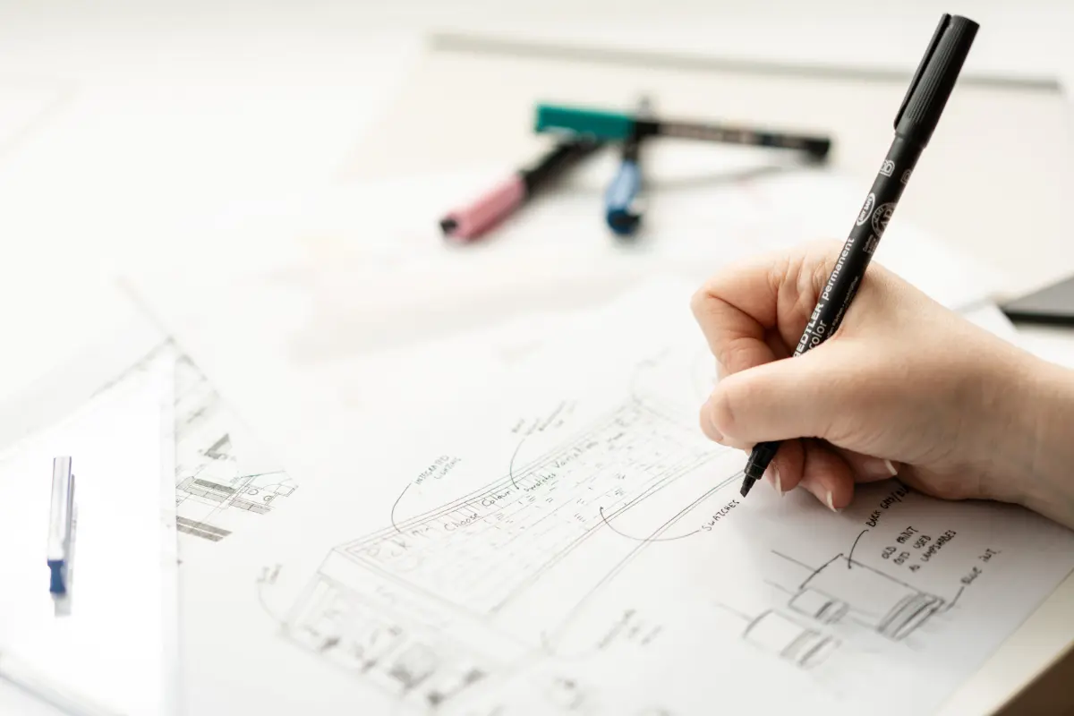

See the result of Elisa’s branding and website here.
Applying consistent editing
Booking a photoshoot isn’t always feasible, either the budget isn’t there, or the nature of your work genuinely makes it hard to photograph. In that case, the trick is to apply a consistent style or filter to whatever images you do use, even if they’re stock photos. Done consistently, it will look intentional and become part of your brand.
This is exactly what I’ve done for this blog. Each featured image has a duotone filter applied and recoloured in my black and yellow brand palette. The photos themselves are stock, but the treatment makes them feel like “mine”. Tools like Affinity or Canva make this kind of thing achievable without a big time or budget investment.
Custom icons & illustrations: when to consider them
If you want to go further, custom visual elements can really elevate a brand, particularly for organisations working on abstract topics like advocacy, research, or social impact, where photography alone doesn’t always tell the story.
Custom icons are a more accessible entry point. A set of icons designed in a consistent style creates visual coherence across your site, reduces the need for photos, and adds personality that generic icon libraries simply don’t have. They sit at a medium price point (not necessarily cheap, but much more accessible than full custom illustration).
Custom illustrations are the higher-investment option, but for the right organisation they can be transformative. They’re particularly powerful for nonprofits and service providers who need to communicate complex or abstract ideas visually, and where a photograph would either be impossible or misleading.
Alternatively, you can purchase packs of icons or illustrations and adapt their colours to your branding. You can find these packs or collections on The Noun Project, Unsplash, Creative Market, just to name a few. Similarly to applying a filter on stock image, this is a more affordable option while keeping their style consistent and a bit personalised.
Whichever route you choose, consistency in style is what makes it look professional. A mix of flat icons and painterly illustrations, or illustrations that don’t match your brand colours, will undermine the effect regardless of how good each individual element is.
A note on AI-generated images
It can be tempting to use AI tools to generate icons or illustrations quickly and cheaply. Used carefully and with a clear brief, it can work, but it’s worth being aware of the risks. AI-generated images have a recognisable aesthetic that’s becoming increasingly easy to spot, and if the output isn’t carefully reviewed and refined, it can end up looking generic and impersonal. That’s the opposite of what you’d want to achieve. If you go down this route, treat it as a starting point that needs human judgement applied to it, not a finished product. (This is the same idea I explained in my article on AI-generated websites vs hiring a web designer)
The real point: consistency and intention over perfection
Whether you use real photography, styled stock, custom icons, or illustrations, the most important thing is that your visual choices feel like they belong together. A consistent style, one that connects to your brand colours, your typography, your overall tone, is what makes a website look considered and professional rather than assembled from wherever was convenient.
You don’t need all of the above. Pick one approach that fits your budget and your brand, and apply it consistently across your website, your social media, and even your presentations. That coherence is what builds recognition over time.