
A team member creates a presentation using the wrong font. A contractor uses an old version of your logo. Someone picks a slightly different shade of blue for a social media post. Sound familiar? Individually these feel like small details. But when they accumulate, they chip away at the professional image you’ve worked hard to build, and in the worst cases make your brand harder to recognise over time.
This is exactly what brand guidelines are designed to prevent.
What are brand guidelines?
Brand guidelines are a document that defines the elements of your visual identity and, more importantly, how to use them. They exist for anyone who ever needs to create something in your company or organisation’s name: a team member putting together a presentation, a new employee writing a newsletter, a freelancer designing an event flyer. Without a reference document, each of these people makes their own interpretation and assumptions of your visual identity. But with guidelines, they have the elements they need to create something new that feels like it belongs.
What should they include?
The basics that every set of brand guidelines usually covers:
- Logo and its variants: your primary logo, secondary versions, and logomark or monogram if you have one. This includes clear rules, like minimum size, safe space around the logo, and what not to do (e.g. stretch it, recolour it, place it on a clashing background, etc.).
- Colour palette: your brand colours with their exact codes: HEX for digital use, RGB for screens, CMYK for print, so that exactly the same colours are always used everywhere.
- Typography: which fonts your brand uses, and sometimes also detailing for what purpose and their hierarchy. Headings in one typeface, body text in another, and sometimes also clear guidance on sizes and weights. It can also establish fallback fonts (when your custom fonts are not available, for example).
- Imagery: sometimes skipped, yet very valuable. It establishes the style of photography, icons, patterns, illustrations your brand uses. These graphic elements help shape the whole visual identity. Without them, your visual communication can feel inconsistent, even when the logo and colours are correct.
Brand style sheet: the one-pager option
Not every organisation / business needs a comprehensive document. If you’re a solo freelancer or a small team just getting started, a simple one-page style sheet covering logo, colours, and typography is a perfectly valid starting point. It gives you and anyone you work with a shared reference without requiring weeks of work to produce.
When I worked with IMPACTips, a boutique impact consultancy launching their brand, we opted for exactly this. With a clear brief, a defined audience, and a small team, a focused one-page style sheet was all they needed to get started and create consistent content.
Going further with brand books
For larger organisations, or at key moments of change, a brand book goes beyond the visual layer. It documents the strategic foundation of the brand: mission and vision, brand personality, tone of voice, key messages, values. It might also establish layout grids for documents, presentations, and social media.
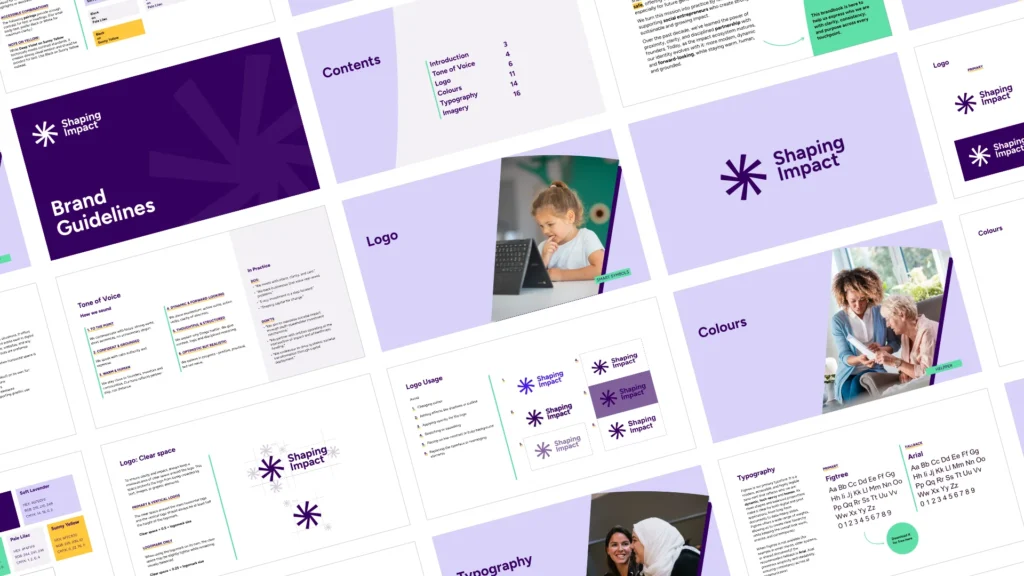
When I worked with Shaping Impact on their rebranding, the visual identity was only part of the story. What started as a potential light refresh evolved into something more ambitious: a complete rebrand, a simplified name (from Shaping Impact Group to Shaping Impact), and a shift in how the organisation wanted to be perceived. A standard set of visual guidelines wouldn’t have been enough to carry that change. The brand book became the document that translated the new positioning (their mission, tone of voice, and visual identity) into a shared reference the whole team could use consistently.
That kind of document makes sense when there’s a genuine strategic story to tell alongside the visual one.
So, when should you invest in brand guidelines?
Here are some situations when it would make sense to produce brand guidelines:
- More than one person is creating content in your name;
- You’re onboarding new team members or working with external contractors;
- You’ve just had your visual identity designed and want to make sure it’s used correctly from the start;
- You’re noticing inconsistency across your channels and can’t quite put your finger on why;
- Your organisation is going through a significant change (e.g. a rebranding, a name change, a new strategic direction).
There’s no fixed rule for how long or detailed your guidelines need to be. A designer can help you assess what level of documentation will actually serve your team, and find the right balance so it’s not too thin to be useful, nor so exhaustive that nobody reads it.