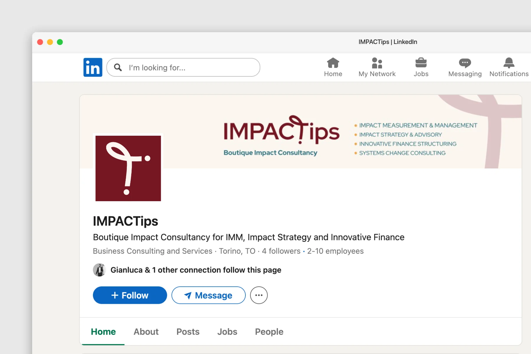
IMPACTips
Alessia and Gianluca had been working together for years before launching IMPACTips, their boutique impact consultancy. When they came to me, they were ready to take the project to the next stage: a new visual identity, a website, and a clearer sense of how to present themselves to the world.
Branding
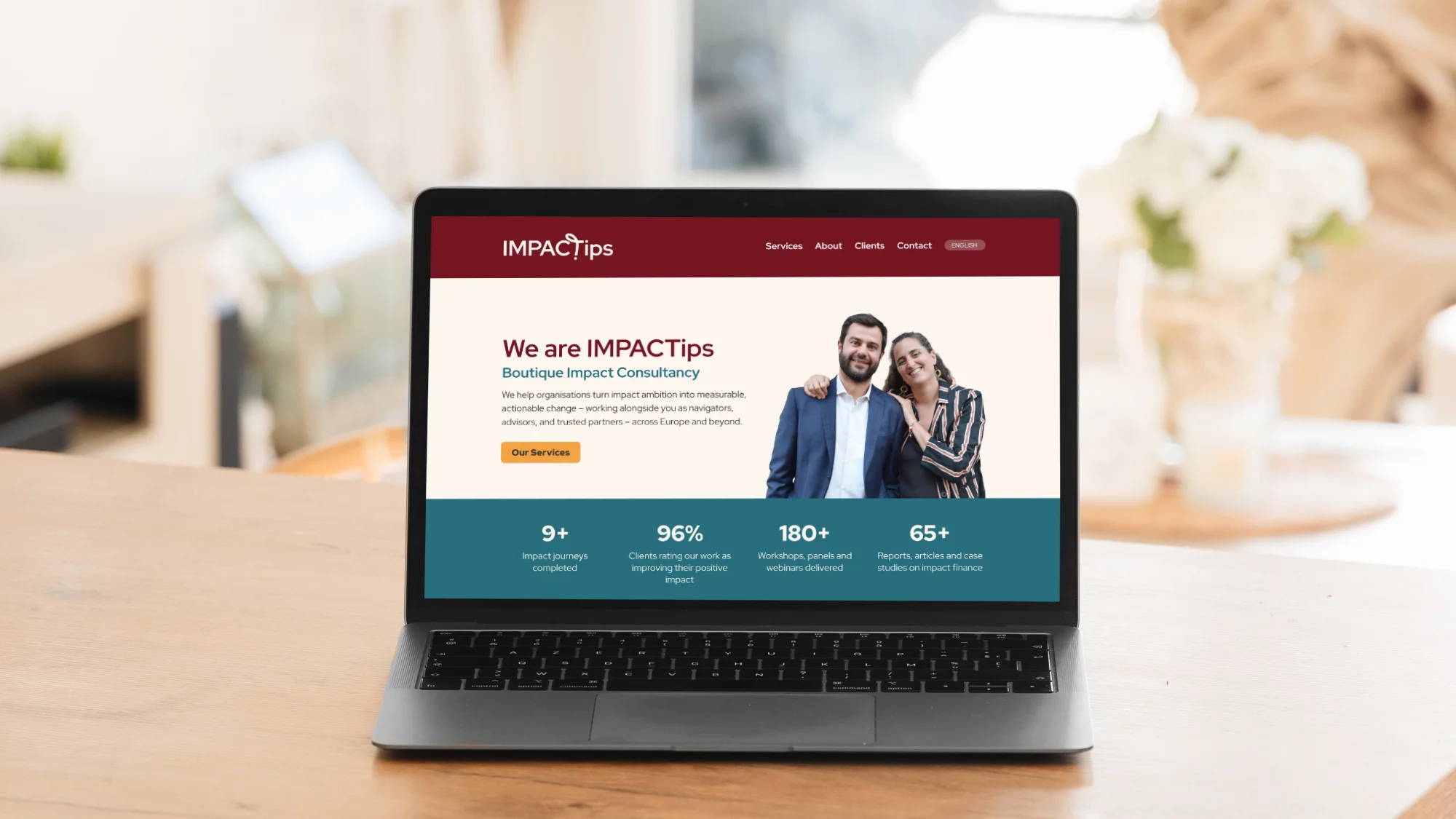
Before any visual decisions, we worked through the foundations of their brand strategy – defining their audience, their positioning, the impression they wanted to give. The brief was clear: professional and credible, yet human and warm. Two things many consultancy firms treat as opposites.
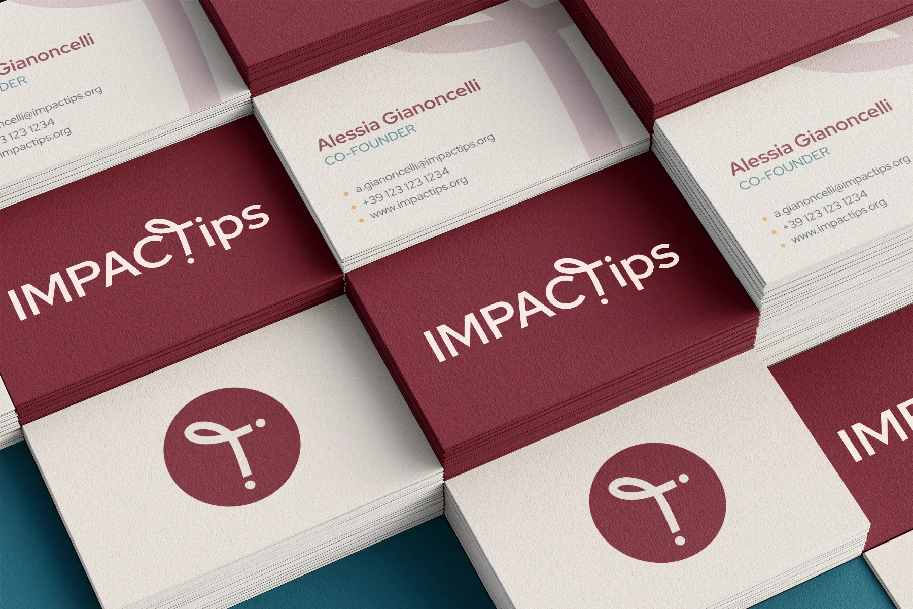
The logo is built around that tension. I worked directly with the letterforms, customising the T at the heart of IMPACTips. A loop grows from the crossbar, suggesting a figure in motion: reaching, connecting, guiding. Two dots anchor the vertical stroke, turning the T into a path between two points. Connecting the dots, literally.
The palette breaks from the usual corporate blues and sustainability greens. Burgundy as the primary colour brings warmth and distinctiveness; Linen, Lagoon and Amber complete it without losing authority.
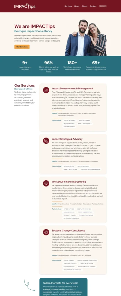
Web design and development
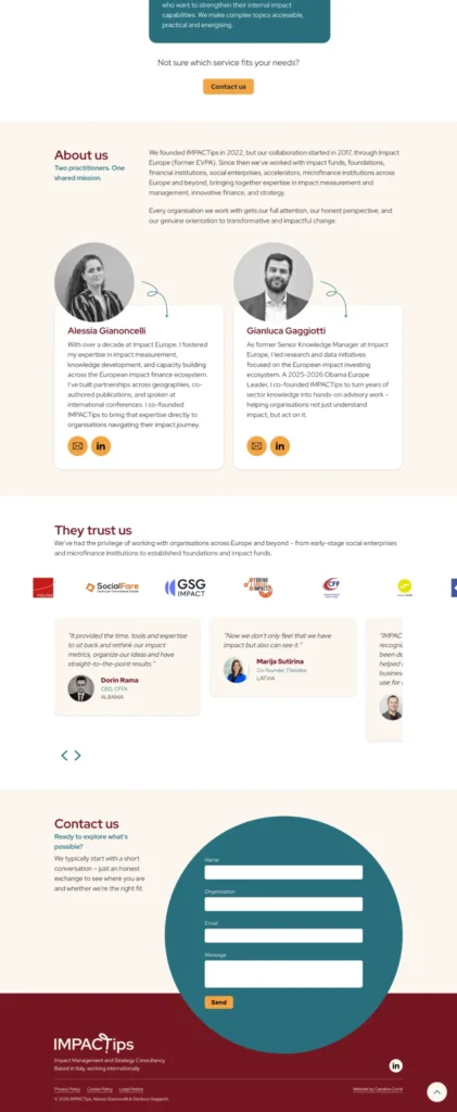
With the brand in place, we moved on to the website. Working within their available time and resources, we built a focused one-page WordPress site – a clear foundation designed to grow into a full multi-page site when the time is right.
The goal was straightforward: a professional online presence with their services presented clearly and a contact form for enquiries. The site is bilingual (Italian and English), reflecting their base in Italy and their international client base. Testimonials and client logos can be updated by the team without any technical knowledge, making it easy to keep their track record visible as the business grows.