Flexidea
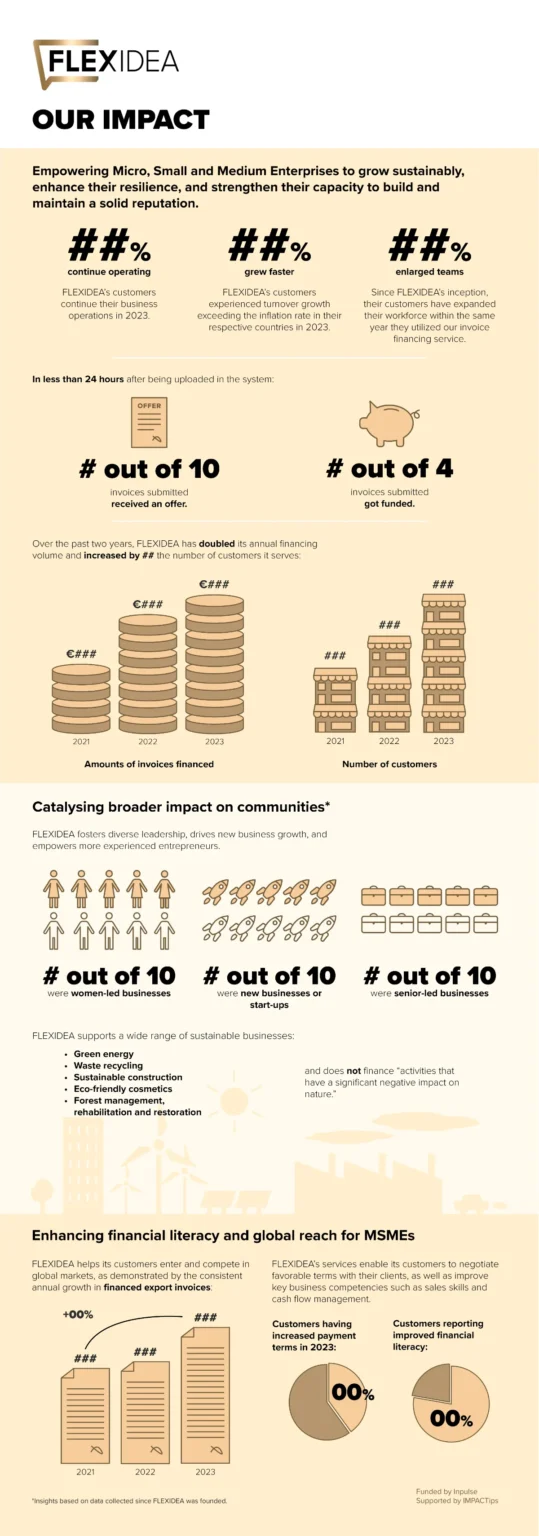
Flexidea and the consultants from IMPACTips shared a draft with key findings from their social impact evaluation. Building on their solid analysis and content, I helped distil the information into an infographic designed for broader communication with stakeholders.
I proposed a clearer structure, refined the visual hierarchy, and translated data into intuitive charts and visual elements, all in close collaboration with the consultants to ensure accuracy and alignment with the intended message.
This project shows how I can help socially engaged organisations communicate their impact with clarity, making data easy to grasp and visually engaging.
Year
2025
Services
What they think
“Wonderful cooperation! Caroline demonstrated a great understanding of our company’s needs and ensured the design was fully aligned with our goals. She not only created visually appealing KPI infographics but also contributed valuable input on how to present the data clearly and accurately. Thank you very much!”
Dace Rukta
Chief Accountant at Flexidea
Need to make data easier to understand?
I design accessible infographics and data visualisations for impact-driven organisations.