Flexidea
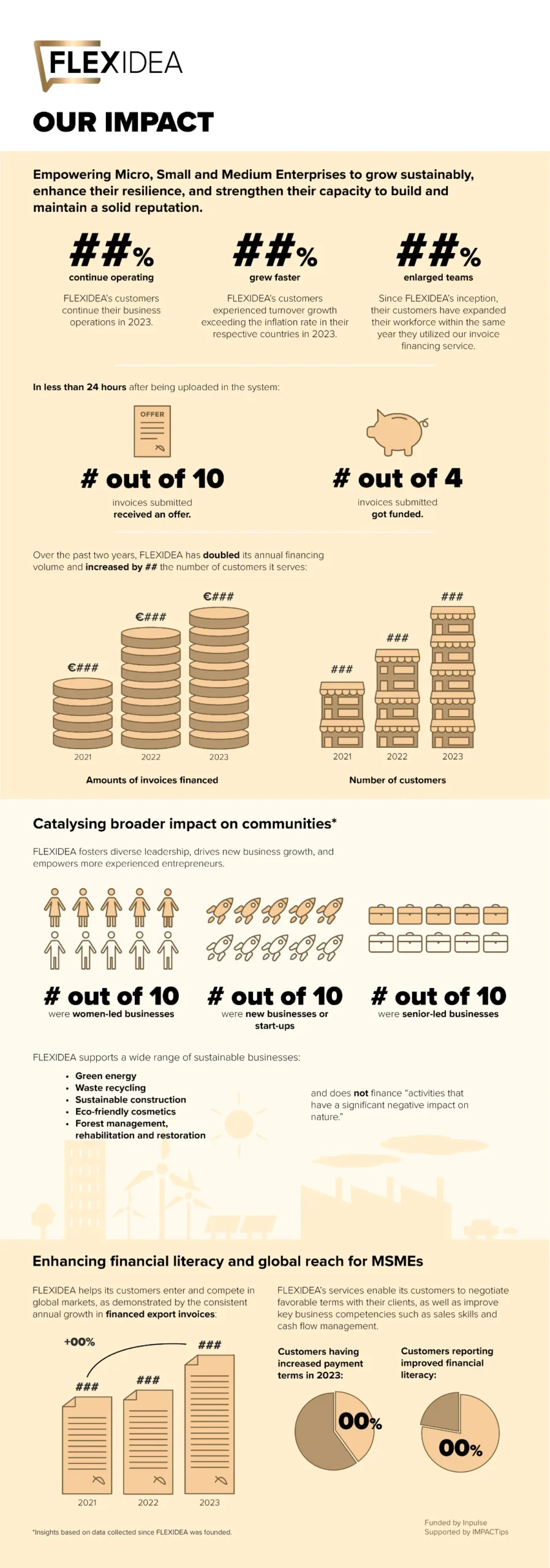
Flexidea et les consultants d’IMPACTips m’ont partagé leur draft présentant les principales conclusions et chiffres-clés de leur évaluation d’impact social. À partir de cette base solide, j’ai contribué à condenser et clarifier l’information dans une infographie destinée à une communication plus large auprès de leur public.
J’ai proposé une structure plus lisible, affiné la hiérarchie visuelle et transformé les données en graphiques et éléments visuels intuitifs, en étroite collaboration avec les consultants pour garantir l’exactitude et la cohérence du message.
Ce projet illustre ma manière d’aider les organisations engagées socialement à communiquer leur impact avec clarté, en rendant les données compréhensibles et visuellement attractives.